I recently attended a couple of excellent talks given at a Northern User Experience meetup, where Patrick H Lauke expounded the virtues of HTML5 while Matt Clark demonstrated the raw power of effective UX design. Jolly good stuff all round, and many thanks to Keith Doyle for making it happen and Simple Usability for hosting. The after-talk pub chat was great too, as was the beer…
The whole evening got me thinking a lot more about UX and user-centred design, not just on websites and digital media in general, but in all areas of our lives where we need to use some form of “interface” to operate or interact with some kind of “service”. This could include POS device such as a chip and pin reader, a lift, a cooker, a station ticket machine, a car interior, (and not just sat-nav).
Keep your eyes on the road…
And thinking of car interiors, it was a small leap, I think you’ll agree, to the self-contained world of Formula 1, (ok, ok – its not really a small leap, quite a big one actually).
As many will know, F1 is a motorsport where regardless of the ever-changing regulations, such antics as risky manoeuvres, avoidable crashes, pile-ups and road rage are all seemingly encouraged and celebrated with the same intensity as they are condemned by road safety experts almost anywhere else…
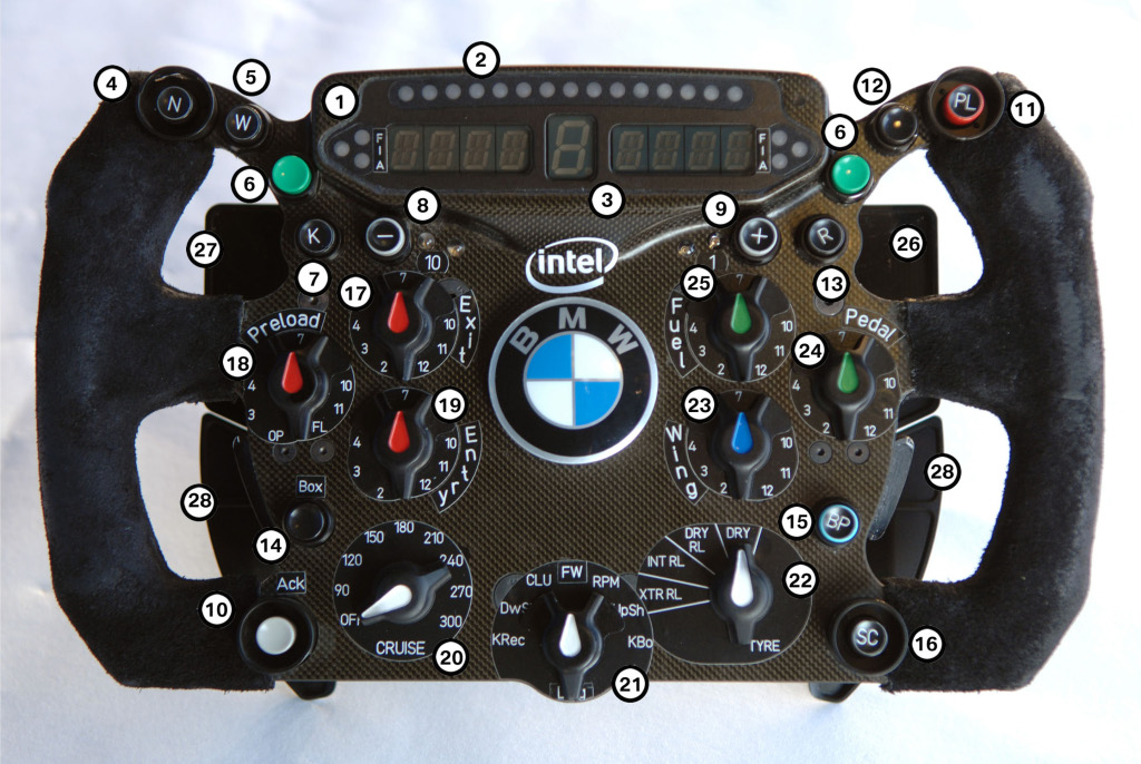
Dubious driver antics aside, the very stimulating UX sessions got me thinking about the usability issues experienced by drivers within the F1 cockpit, and the steering wheel in particular. For example, lets take a look at Robert Kubica’s 2009 model:-

Robert Kubica's 2009 F1 Steering wheel: user-friendly or what?
Those LEDs are just soooooo retro! You could be forgiven for thinking the wheel was cobbled together by someone in a garage using parts from the Maplin catalogue, ready for his old ford focus…
You might think that in the pinnacle of Motor sport, F1 designers would have come up with something looking a bit more sophisticated, or elegant – practical even.
But here’s the thing – does it actually matter what it looks like?
…true ergonomic precision?
Perhaps to the casual eye, it looks as if the wheel has been thrown together, with no less than 28 buttons and knobs placed wherever they can fit. But from a UX perspective, this little electronic forest might be a perfect solution, with each knob, button, lever, paddle and switch perfectly positioned with true ergonomic precision, exactly where the driver needs it to be, so he can (without looking) access with lightning speed the required steering wheel functions at critical points in the race …
Or maybe not.
Famously, British driver Lewis Hamilton was reported to have pressed the neutral button while at full speed in the final and deciding 2007 Brazilian GP, a feat which dropped him back through the field and effectively cost him the world drivers championship.
It was quite embarrassing for Hamilton, he’d had a sensational rookie season and his mistake was attributed to nerves.
Since then, Hamilton has explained that he never did press the neutral button, and the button he pressed was after his gearbox had failed.
I’m inclined to believe Hamilton’s version, but it does make you wonder how easy it would be for a driver to press the wrong button. Indeed in subsequent races it has happened – with dire consequences for the driver concerned.
Green is for Go, er no sorry, Stop!
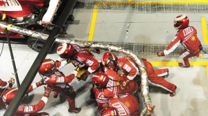
Another area where UX design might have usefully have come into F1 is the pit stops. In 2008, Ferrari’s Felipe Massa managed to drag half his crew and a fuel hose the length of the Singapore Pit lane, when he pulled out of the pits too early.

"After him boys - he hasn't paid"
At first the driver was blamed, but later it became clear that a new traffic light system had been introduced but didn’t actually work.
It is claimed that this single simple (user) error might have cost Massa the drivers world championship.
During the race, a Ferrari crewman pressed the ‘ready’ button too early, Massa was given the green light to drive away. He did so, and once the frantically chasing pit crew stopped him and got their fuel hose back, he’d dropped way down the field. It is claimed that this single simple (user) error might have cost Massa the drivers world championship.
It does make you wonder what sort of testing was undertaken to ensure the users of the “innovative” traffic-light release system could actually operate it successfully… and who knows what difference a little bit of user-centred design expertise might have made…
…maybe the difference between winning and losing.


