Here are my top 10 tips for handling your clients. Based upon my own hard-won experience, they have helped me successfully deliver complex digital solutions, such as web sites, touch-screen kiosks and software. I consider them crucial to project success…
Continue readingClient-facing skills: Simon’s top 10 tips for success
How to create a great user experience that’s also great for your business
Always remember, web sites that look good and navigate well, feel good too…
And a website that feels good to use is far more likely to encourage users to do what you would like them to do.
This can be anything from making an on-line purchase, making contact with your call-centre, reading latest news, promoting a film – whatever the goal of your website is.

Horrendous design or great user experience? Or both?
Web designers look away. This site is an early version that supported the now infamous Borat movie. It looks as if it breaks just about every design rule going, but it is appropriate to the content, i.e. outrageously comedic, and is actually very user-centric.
However, to find out what your users really think, feel and do when visiting your site, perform user testing. To prove that your users have a great experience, one that encourages them to interact with your site and respond positively to your goals or calls to action, test for three major areas or considerations:-
1. Do users experience your site is user-friendly, easy to navigate and with minimal confusion? The golden goal of all websites is to avoid “bouncing” – that is, users taking one look at your landing page and then leaving immediately.
Assuming you have caught the interest of your user and they do decide to stay on your site, the next challenge is to give them quick, easy and enjoyable journeys through the site to your chosen outcomes or goals.
If you want users to come back again and again, and if you want them to perform repeat interactions and transactions, the easier you make it for them, the more likely the are to want to do this.
How the website is laid out, how intuitive the navigation is, and how clearly laid out the offer is, how easy the supporting information is to find, are all key design criteria that you need to harness to make your users’ experience rewarding and worthwhile.
2. Do users say that your site’s look-and-feel reinforces and focuses your brand? The look and feel is as important as the navigation, in that it has to be consistent with your brand message. Your logo, styling, images and typography make the user’s experience more memorable, and helps to differentiate your site from your competitors.

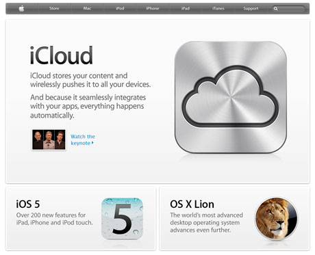
Clean, minimalistic design is consistent with Apple's distinctive branding
This does not mean to say your site needs to be overloaded graphics or other media, nor does it imply the opposite – a bare bones, minimalistic look and feel. The design must be informed by the brand and purpose of your site to ensure it looks and behaves in the way the user expects.
3. Do users experience the content of your site as engaging and reinforcing your offer? Now that we have so much user-generated content in websites, it is extremely easy to overlook the need for effective content design.
Even if you are commissioning a CMS driven website, effective content structuring, copy styling and the appropriate “voice” of your site all need to be defined and made consistent with your offer.
Without a professional hand, you may well end up with poorly considered or even irrelevant copy, which can give your users a mixed or confused message, reduce conversion rates, dilute your brand and ultimately drive your users away.
A further issue is that inconsistent copy writing and content design can wreck your page ranking, by confounding search engines such as Google and others, as they are particularly sensitive to copy and content that does appear to relate to the stated purpose of your site.
How to win in Formula 1 with UX Design
I recently attended a couple of excellent talks given at a Northern User Experience meetup, where Patrick H Lauke expounded the virtues of HTML5 while Matt Clark demonstrated the raw power of effective UX design. Jolly good stuff all round, and many thanks to Keith Doyle for making it happen and Simple Usability for hosting. The after-talk pub chat was great too, as was the beer…
The whole evening got me thinking a lot more about UX and user-centred design, not just on websites and digital media in general, but in all areas of our lives where we need to use some form of “interface” to operate or interact with some kind of “service”. This could include POS device such as a chip and pin reader, a lift, a cooker, a station ticket machine, a car interior, (and not just sat-nav).
Keep your eyes on the road…
And thinking of car interiors, it was a small leap, I think you’ll agree, to the self-contained world of Formula 1, (ok, ok – its not really a small leap, quite a big one actually).
As many will know, F1 is a motorsport where regardless of the ever-changing regulations, such antics as risky manoeuvres, avoidable crashes, pile-ups and road rage are all seemingly encouraged and celebrated with the same intensity as they are condemned by road safety experts almost anywhere else…
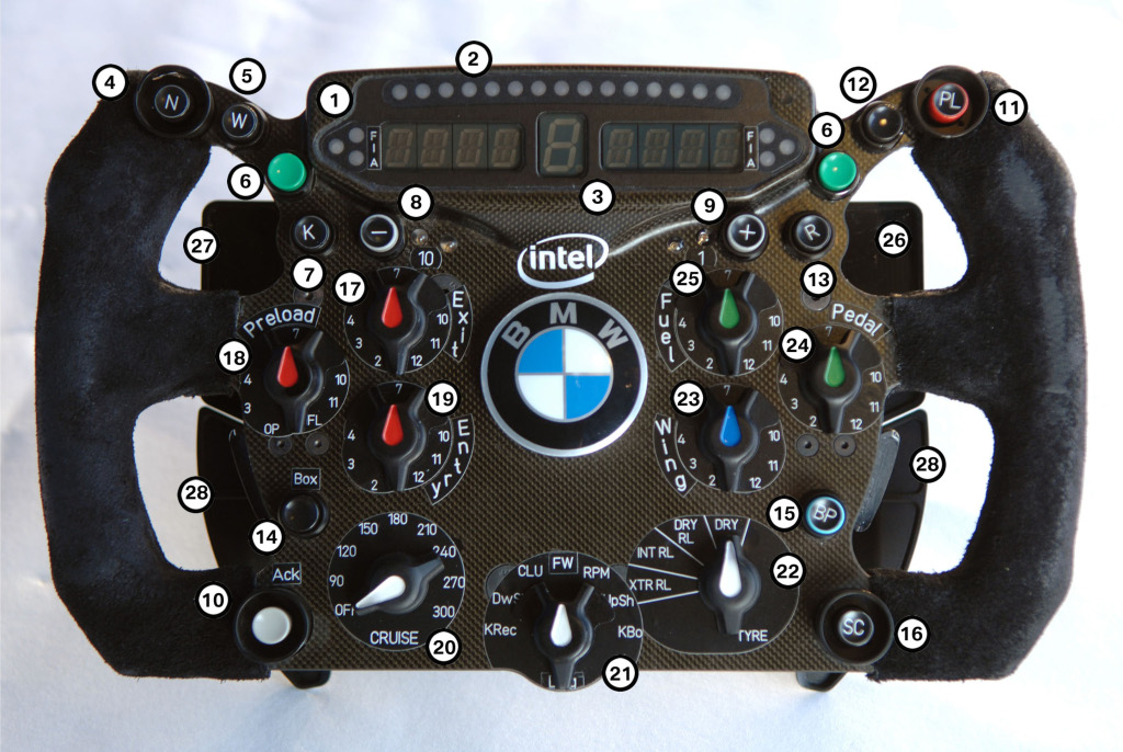
Dubious driver antics aside, the very stimulating UX sessions got me thinking about the usability issues experienced by drivers within the F1 cockpit, and the steering wheel in particular. For example, lets take a look at Robert Kubica’s 2009 model:-

Robert Kubica's 2009 F1 Steering wheel: user-friendly or what?
Those LEDs are just soooooo retro! You could be forgiven for thinking the wheel was cobbled together by someone in a garage using parts from the Maplin catalogue, ready for his old ford focus…
You might think that in the pinnacle of Motor sport, F1 designers would have come up with something looking a bit more sophisticated, or elegant – practical even.
But here’s the thing – does it actually matter what it looks like?
…true ergonomic precision?
Perhaps to the casual eye, it looks as if the wheel has been thrown together, with no less than 28 buttons and knobs placed wherever they can fit. But from a UX perspective, this little electronic forest might be a perfect solution, with each knob, button, lever, paddle and switch perfectly positioned with true ergonomic precision, exactly where the driver needs it to be, so he can (without looking) access with lightning speed the required steering wheel functions at critical points in the race …
Or maybe not.
Famously, British driver Lewis Hamilton was reported to have pressed the neutral button while at full speed in the final and deciding 2007 Brazilian GP, a feat which dropped him back through the field and effectively cost him the world drivers championship.
It was quite embarrassing for Hamilton, he’d had a sensational rookie season and his mistake was attributed to nerves.
Since then, Hamilton has explained that he never did press the neutral button, and the button he pressed was after his gearbox had failed.
I’m inclined to believe Hamilton’s version, but it does make you wonder how easy it would be for a driver to press the wrong button. Indeed in subsequent races it has happened – with dire consequences for the driver concerned.
Green is for Go, er no sorry, Stop!
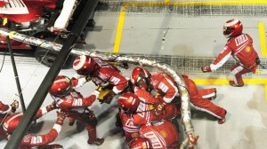
Another area where UX design might have usefully have come into F1 is the pit stops. In 2008, Ferrari’s Felipe Massa managed to drag half his crew and a fuel hose the length of the Singapore Pit lane, when he pulled out of the pits too early.

"After him boys - he hasn't paid"
At first the driver was blamed, but later it became clear that a new traffic light system had been introduced but didn’t actually work.
It is claimed that this single simple (user) error might have cost Massa the drivers world championship.
During the race, a Ferrari crewman pressed the ‘ready’ button too early, Massa was given the green light to drive away. He did so, and once the frantically chasing pit crew stopped him and got their fuel hose back, he’d dropped way down the field. It is claimed that this single simple (user) error might have cost Massa the drivers world championship.
It does make you wonder what sort of testing was undertaken to ensure the users of the “innovative” traffic-light release system could actually operate it successfully… and who knows what difference a little bit of user-centred design expertise might have made…
…maybe the difference between winning and losing.
Web standards: reet grand or rather nice?
Anyone living in Yorkshire having previously having lived most of their life in the south, say, for example in London, (where I spent most of my career before starting a new business ‘oop north), will have been struck on first arrival by the prevalence of the very “user-friendly” Yorkshire dialect, especially in places like supermarkets, trains, local shops and bars and so on. Continue reading
Freelancer bliss: Keeping your Illustrator artwork manageable (1)
Working as a freelance web developer or artworker, tight deadlines and different working methods across studios mean you need to be on your toes when it comes to working smart and fast. Continue reading


